The shoot was further challenged by fast moving clouds, so constantly changing light conditions, and having broken my 18-55m lens, I was relying on a 55-200m lens. This is notwithstanding getting caught in hail shower and trying to get shots without people wandering in and out of view!
The results of the exercise are as follows; in my view, not all scenes work vertically, some work better horizontally - it really depends on the subject matter. For me, it is not about habit, as I already shoot vertical images. I often try something in both aspects to see which in practice works well (one of the advantages of digital photography!).


Naturally, the first images were shot at the entrance; in these I think the vertical format works better; the weight of the columns balances the statues. However, I like the clouds in the horizontal format, which are lost in the vertigal format. Perhaps a few seconds later, I may have got both!

The next pair were taken of the detail on the entrance gates using a wide aperture to gain clarity on one of the ornaments. With this pair, I think the horizontal format works better, as more detail of the gate is captured.

I then stumbled across an interesting doorway. Clearly in this sequence, the vertical format is better; not only because more of the gold leaf is captured, but also the format reflects the shape of the doorway. With the horizontal shot, I was also limited by the choice of lens and position. Had I stood further back, this aspect may have worked too.


With this next pair of images, both aspects are balanced, but I prefer the horizontal layout: the composition is marginally better.


Next to the bridge; which aspect here is better depends on whether more sky or more bridge is preferred. The horizontal aspect, initially seems better composition, but with the sky being interesting on this day, the vertical shot also works.


Back to the palace; in this pair, the vertical scene works better. For a start the tree has not been accidentally cropped at the top (limitations of the lens), the festival sign is excluded, and the scene is more balanced by cropping the right of the building, which adds unnecessary detail. Had I shot more sky and less grass, the vertical image would have been even better.


Next to the palace entrance; the vertical image also works better in this pair, as it captures the interesting relief above the doorway and excludes the building aspect to the left. Although in the horizontal aspect, I like the continuation of the wall in the foreground towards the left. Had I been stood further back, the horizontal image may have worked better overall.


Then a lucky sighting; two palace members of staff in their uniforms. Here the vertical aspect is clearly the better shot: it includes the full archway of the bridge and provides height above their heads plus a full body shot.


To the left of the uniformed ladies, I noticed a little doorway with a balcony. In this shot, I prefer the vertical position; the doorway is better balanced among the five other windows making more of its corner position.


Moving onto gargoyl-like statues (gargoyls are a particular favourite of mine); with this pair, the vertical aspect also works better: it reinforces the column supporting the statue, and the adjacent lampost, whilst also capturing some cloud detail. The shot could have been improved by exluding the edge of the wall to the right of the picture (I would crop this if I were going to use the image). I also like the fact that the vertical image is able to capture the corner of the wall and exclude the extending structure to the left.


Looking around, I noticed the statues on the edge of the gable. This shot was unfortunately challenged by the light. I prefer the vertical position; it captures more of the detail on the chimney and the position of the window balances the shot. This image would have been improved though had I zoomed in further and just focused on the little statues.


Then I noticed a plaque on the wall of the Emporer Nero (why?). In this photo, although the subject matter and the angled wall lends itself to vertical composition, the horizontal frame works better as the image is balanced and made more interesting by the detail of the window on the right.


Then, a break in the clouds, meant that I could get a shot of the flag I had noticed flying above the ramparts. I think the vertical frame is more balanced; it emphasises the flag pole, gives greater height to the sky and greater depth to the building structure below the flag.


With some good light now, I returned to the gargolye-like statues; I think both these frames work equally well. The vertical frame emphasises the shape of the dragon's back and bolsters it, but the horizontal frame captures more sky and more of the doorway and flag behind. I used a wide aperture to blur the background here.


Now to the relief above the entrance to the main building; in this case I'm not sure either frame has worked. The horizontal position is not centred, so for reproduction that would have to be cropped; the vertical frame does not include enough of the surrounding to balance the image. The image is also split in two. This subject is better, either zoomed in to a section of the subject, or as part of a wider composition (as captured above).


After this I wandered round to the left. I noticed the continuation of windows on the long building on the left of the main entrance. I initially thought the horizontal aspect would work better as it would capture more windows, but in fact, by excluding the window to the right, the vertical aspect achieves the same effect, with the result that the vertical fame is more balanced. It includes foliage underneath the windows, so the horizontal and vertical planes are weighted. In addition, in the vertical frame the top of the all but one windows are included. This preference is marginal though; both images work and with a different lens, the horizontal frame would probably be the better option.


Then I noticed an interesting rounded cross shape on the wall; I don't have a preference for either frame here, I think they both work. The vertical frame emphasises the upright of the cross and the window, whereas the horizontal frame includes more detail of the window.
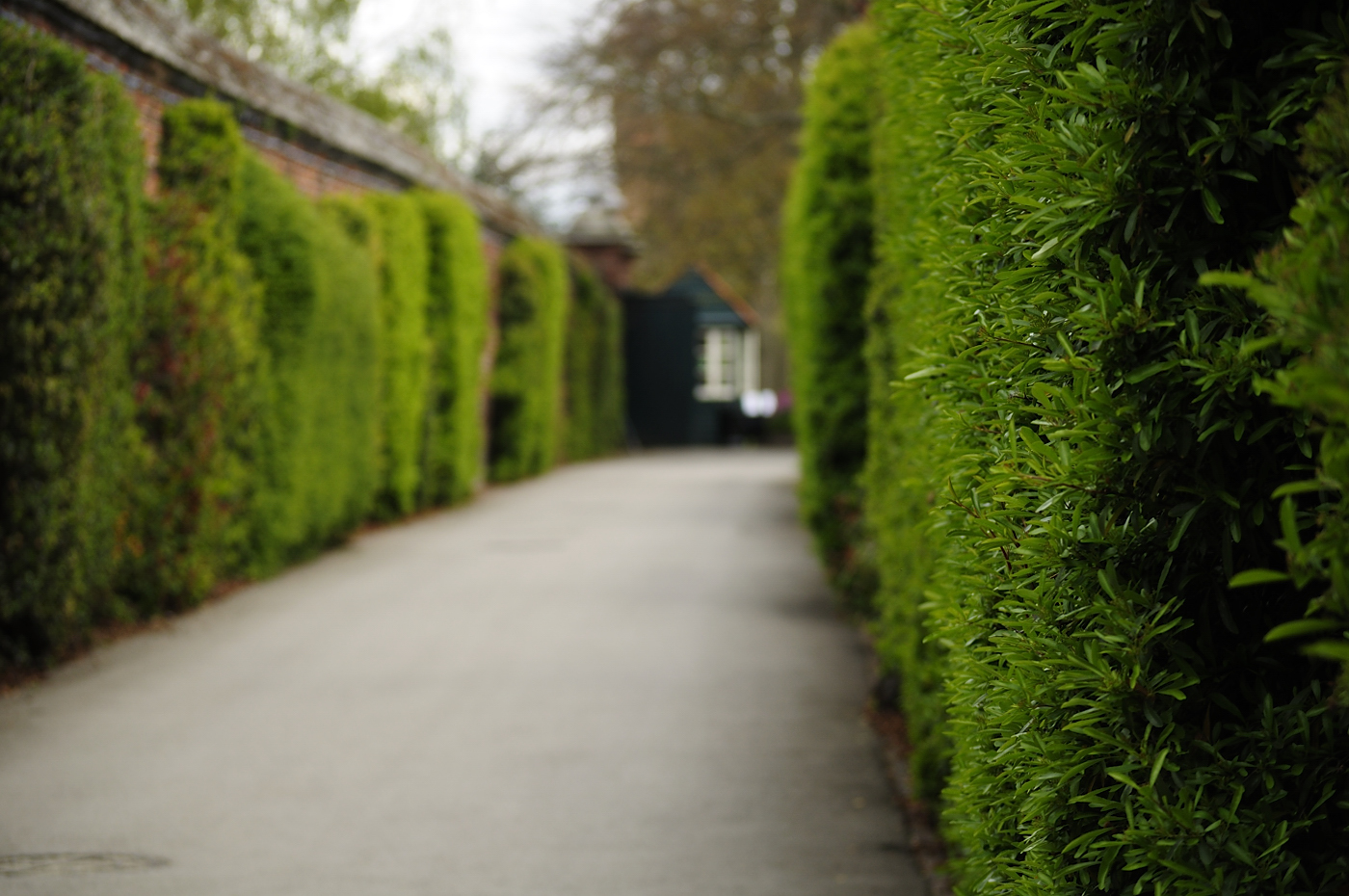

Next into a walled pathway lined with foliage; for these shots I used a wide aperture to blur the background and focus on the leaves to the right foreground. I think both shots work well here; the horizontal is interesting as you see the pathway with the kiosk at the end and the vertical is interesting as you are left wondering what is on the left-hand side.


Finally, at the end of the pathway, I saw a tree with huge roots surrounded by bluebells. In this shot, the vertical frame works better as it emphasises the tree and shows the depth of the bluebells in the background. If I were going to use this image, I would crop the top slightly to remove the edge of the bed.
No comments:
Post a Comment