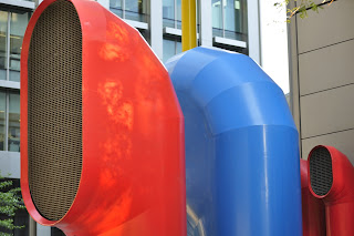
This was an exercise in varying exposure (aperture) to examine the affect on colour. There are some brightly coloured funnels near my office on London Wall, so I chose these to carry out the exercise. The objects were mostly in shade, so I used a high ISO so as to be able to get the average metered control photograph at an aperture with room for variation either side. The funnels were shot at a zoom length of 68mm and matrix metered (maybe spot would have been better to have made more of the reflections??).
Here is the control photograph at ISO 800, 1/125s and f/5.6:
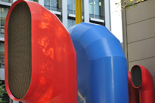 |
| f/5.6 |
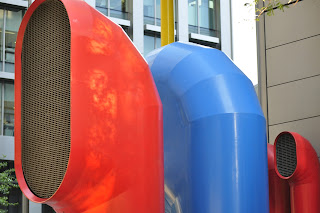
At one stop higher at f/8, the colours are slightly more saturated in the red and blue, but little difference in the yellow. The image overall is a bit duller, but there is not a huge difference. This may have been to do with the lighting.
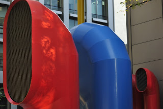 |
| f/8 | | | | |
I tried again at another stop higher at f/11. There is a greater difference at this aperture in comparison to the control. The image is darker overall, the colours are duller and less intense. You can also see noise from the high ISO.
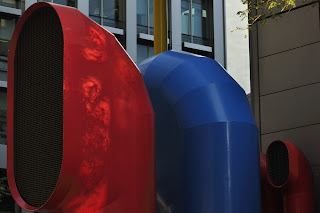 |
| f/11 | |
Working back down through the apertures, between f/8 and f/5.6, I shot f/6.7; the only real discernable difference between this and the control image is that the orange reflections from the large red funnel are a deeper orange:
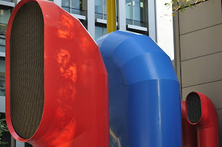 |
| f/6.7 |
Dropping the aperture now below the control photograph to f/4.8, the colours are starting to look very slightly washed out and the overall image is brighter. The red and blue colours are slightly weaker, i.e. less saturated, and the yellow is very slightly less saturated.
 |
| f/4.8 |
Finally, at the lowest aperture possible with the lens and settings I was using, which is almost one stop brighter, I shot at f/4.2; at this f/stop, the colours are even less saturated.
 |
| f/4.2 |
This exercise has shown that the differences in colour saturation are quite subtle, but if for instance I wanted to alter the saturation of a subject in shooting, I could adjust the exposure by stopping up or down the aperture.
Interestingly (and unintentionly), the shots I used to mark the start and end of the exercise on my disc illustrate this very well; at f/5.6 the pavement is washed out, but at f/22 the colour of the paving stone is deeper and richer.
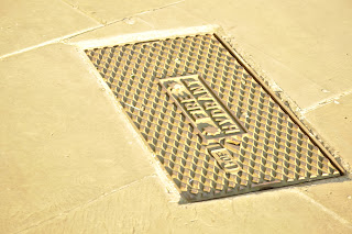 |
| f/5.6 |
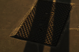 |
| f/22 |
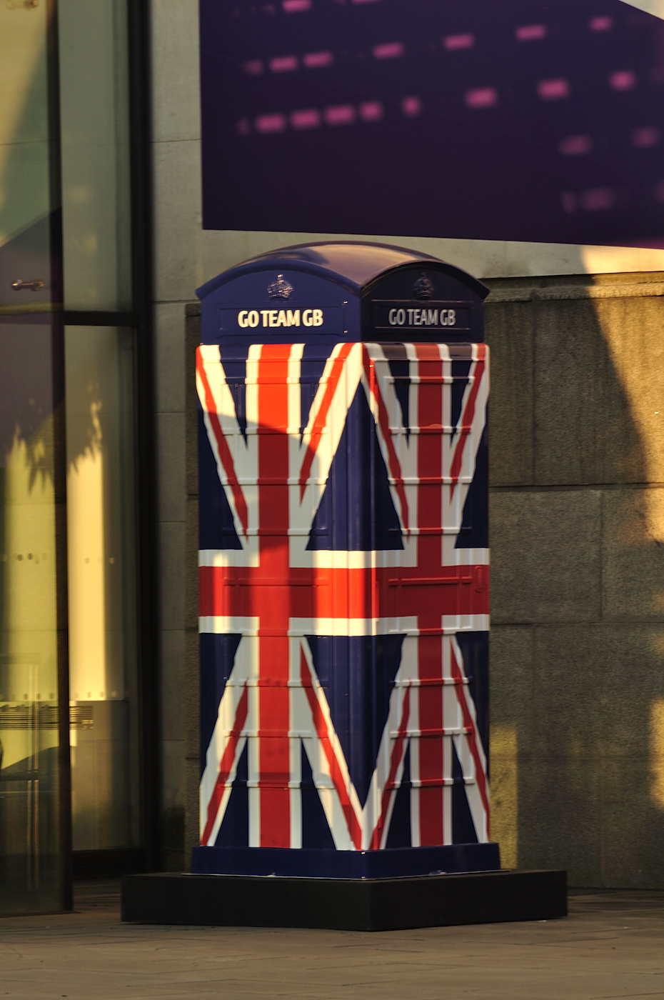
Concerned that the differences I noted where very subtle, and possibly influenced by the shade and high ISO, I repeated the exerise using a different subject: a brighly painted telephone box celebrating the Olympics outside the BT building on Newgate Street:
The control shot was taken again using matrix metering, but at ISO 200, 1/125s and f/8.
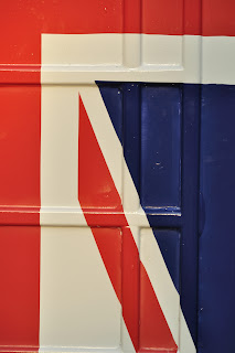 |
| f/8 |
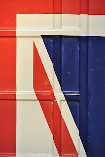
At one stop higher at f/11, the three colours are darker, deeper and duller. The overall image is less bright.
 |
| f/11 |
At a half stop lower, in between the image above and the control, at f/9.5,the colours are very similar to the control at f/8. I noticed also that my reading was fluctuating between f/8 and f/9.5 to get the average exposure, so the light must have been changing at the time.
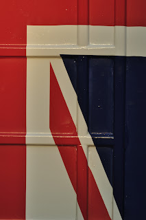
I then moved dropped the aperture below the average exposure to f/6.7, which is half a stop brighter than the average metered exposure of f/8. You can see that the colours are slightly less saturated than at f/8; the red is a little more orange and the blue is lighter - more of a royal blue than navy. The white is starting to look a little overexposed as well.
 |
| f/6.7 |
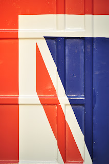
At a full stop below the control exposure, at f/5.6, the effect is even more pronounced: the red is more orange i.e. less saturated, the blue is brighter, more cobalt than royal blue, and the white highlights are becoming indistinguishable.
 |
| f/5.6 |
Finally, at a third stop lower or brighter still, I shot at f/5, where the same effect described above is even more obvious:
 |
| f/5 |
From this exercise I have learnt that adjusting the aperture to brighten the exposure i.e. lowering the f/stop will make the colours less saturated and brighter, and darkening the exposure i.e. raising the f/stop will make the colours more saturated, darker and duller. This is important to remember when white is present as if white is overexposed the reflections/highlights disappear.
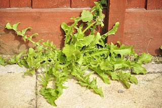
I then decided that I should try this with green; I take a lot of photos outdoors in the Lake District and it is very difficult to get the right green - particularly when the sky is very cloudy or very bright. So I shot some weeds growing in my back garden in London (not much greenery in Feltham!) at ISO 200 and 500s (matrix metering). The average exposure calculated was at f/8 and the results show that this was the most accurate representation of the real colours.
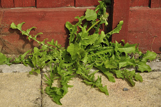 |
| f/8 |
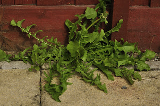
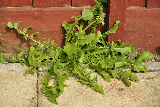 |
| f/6.7 |
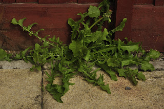
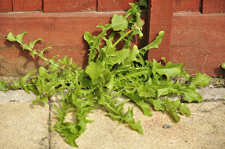 |
| f/5.6 |
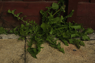
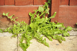 |
| f/4.8 |
 |
| f/4.2 |
 |
| f/9.5 |
 |
| f/11 |
 |
| f/13 |
This exercise has taught me a lot about the impact of varying exposure on colour. One solution is to use exposure bracketing, so you can decide afterwards which is the most ideal representation. I have used this feature a bit recently, but on the whole, I found that the average metered setting was the best, except in situations where there is a lot of black or white in the photograph. This information will be useful to remember when using a very low aperture for a particular effect, to remember that it may potentially wash the colours out if exposure is not compensated through shutter speed and/or ISO. I also finally understood what people mean when they say "one stop lower" etc and found this very useful reference table:
http://www.scantips.com/lights/fstop.html


No comments:
Post a Comment